18
December, 2015
BRANDING FOR FORMER TERRY’S CHOCOLATE FACTORY
Paying tribute to the Art Deco style of the building

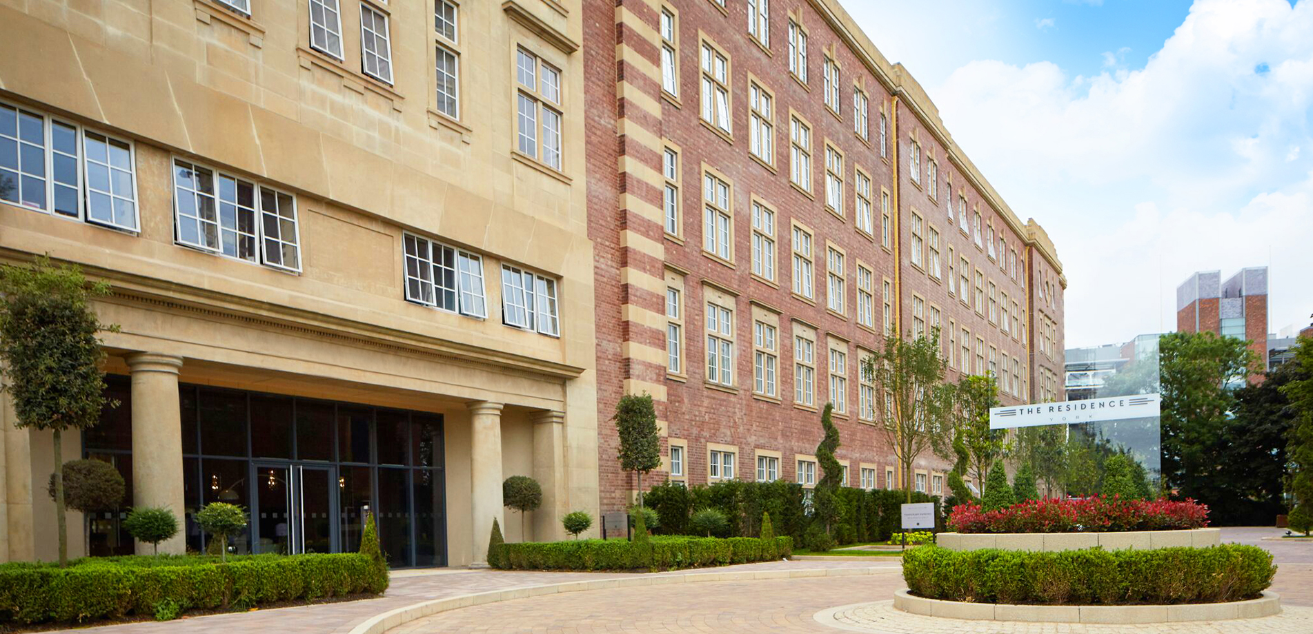
Our redevelopment of the Grade II listed building at the former Terry’s Chocolate Factory in York will be known as The Residence. The name reflects the grand nature, not only of the building itself but the luxurious, exclusive apartments that are being created there.
York joins our collection of other opulent ‘Residence’ developments. Both ‘The Residence’ at Dartford and Lancaster also feature large landmark buildings of huge scale but all have their own unique character.
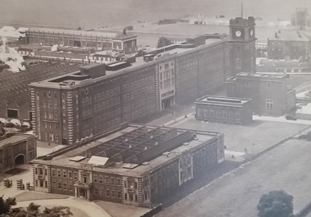
The brief at York was to pay tribute to the Art Deco style of the building which was completed in 1926. Our in-house design and marketing team started the process with extensive research into the history of the site, the legacy of the Terry family buildings and the locality.

They visited Goddard’s, Noel Terry’s family home just half a mile from the site and now owned by the National Trust and liaised with the Broderick Institute at York University which holds the copyright of many historic photographs in its extensive archives.
A DISTINCTIVE ART DECO STYLE
Graphic Designer Liz Brassington said: “The distinctive art deco style and detailing to the building and facade provided an initial source of inspiration for the logo design.
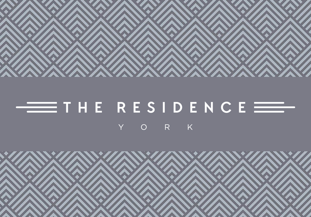
“Further research into the stylised forms of the 1920s era and associated marks led to the development of the triple line used as a graphic device within the logo and a complimentary graphic pattern for a secondary use within the marketing collateral.

“We developed this strong brand concept by using classic colours, materials and typography to convey a feeling of quality which perfectly reflect the style and exclusivity of this prestigious development.”
LUXURY APARTMENTS FOR YORK RESIDENTS
It is important that the re-born building can distinguish itself in its new role as luxury residential so obvious references to chocolate were avoided in the name.
But we did find a much subtler and more sophisticated way to acknowledge the building’s history. The typeface we are using, chosen for its discreet Art Deco feel, is ‘TT Chocolates ‘ which seemed entirely appropriate to us.
This Development is Now Completed.
For Further Information About the Project Click the Button Below.